Monday, 31 January 2011
Magazine Front Cover

This is our final draft of our magazine front cover, we decided to change the main image and incorporate a film strip onto the cover. This was inspired by the horror magazine Fangoria.

Making the music
To make the music we used 'GARAGEBAND' we had to decided what type of music we wanted whether we wanted intense or soft. We had to try and fit our music with the trailer. We decided that the build up would be gradual and sudden. We used instruments such as the piano to create this.


Tuesday, 25 January 2011
While Shooting
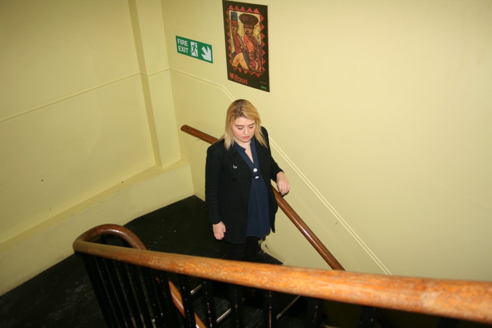
While shooting footage for the trailer, I decided to take some pictures and see if they would be suitable for the front cover of the poster or magazine. I thought that I had some really good shots that we could use, so I compared the photographs from the previous photo shoot and the ones taken at the abandoned school and decided which ones were appropriate to use. We overall used picture from our last footage and our recent one as they interrelated with each other.


Shooting Script
Shot 1 - Grace outside building, close-up shot, showing only her head and shoulders. Lasts for approx. 3 seconds. Exterior shot. High key lighting.
Shot 2 - Long high angle shot at top of stairs inside building. Showing grace running up stairs. Lasts for approx 2.5 seconds. Interior shot. Low key lighting.
Shot 3 - Grace running through long connection of rooms as camera tracks back with her. Medium close up shot. Interior shot. High key lighting. Lasts for approx. 3 seconds.
Shot 4 - Similar shot of Grace running through rooms but Low angle shot. Long shot. High key lighting. Lasts for approx. 3 seconds.
Shot 5 - Grace trying to open fire exit. High angle shot. Stationary camera. High key lighting. Lasts or approx. 5 seconds. Interior shot.
Shot 6 - Shot of Grace running down fire escape stairs. Low angle tracking shot. Exterior shot. High key lighting. Lasts for approx. 2 seconds. Long shot.
Shot 7 - Shot of Grace getting to bottom of fire escape stairs. Medium long shot. Exterior shot. High key lighting. Lasts for approx. 2 seconds.
Shot 8 - Depth of field shot. Two different points of focus, car and Grace. Long shot of Grace running to car. High key lighting. Exterior shot. Lasts for approx. 4 seconds.
Shot 9 - Low angle shot through car window towards Grace. Medium shot. High key lighting. Lasts for approx. 3 seconds. Interior shot.
Shot 10 - Close-up shot of hands on gate. High angle shot. High key lighting. Lasts for approx. 1.5 seconds. Exterior shot.
Shot 11 - Close-up shot on roof of car at Grace. High key lighting. Lasts for approx. 2 seconds. Exterior shot.
Shot 12 - Long shot of Grace. Through window looking out at her. Low key lighting. Tracking shot. Steady cam. Lasts for approx. 7 seconds. Interior shot.
Location
For our location we went to an abandoned school inside of our college. We decided that this was the best place to film as it seemed as a set for a horror movie. The majority of filming was taken place outside in the playground.


Saturday, 22 January 2011
Storyboard for our Teaser Trailer Second Idea


This is our second idea for our storyboard, we used this layout for our trailer. Our second storyboard is clearly much more detailed than our first storyboard. I believe that with this one we had a more clearer vision of what we wanted our trailer to be like. This storyboard had much more detailed descriptions for each shot and was greatly aided by a pre production visit to our shooting location as we knew how the areas would look when structuring our drawn images for our storyboard and when filming.
Friday, 21 January 2011
Teaser Trailers And Horror FIlms: Codes And Conventions
There are many codes and conventions for teaser trailers and horror films.
For example with teaser trailers there is the time limit convention of a teaser trailer normally being very short, around 30-60 seconds long. In this time it will have shown you a basic outline of what the new film is about. It may include text to ask you questions which may relate to what the film is about, or just take your thoughts away from what the film could really be about.
The main purpose of a teaser trailer is that it is made to make you aware of a new film whixh is still being edited or produced. Some teaser trailers show just the first ideas of what they want to produce for the real film, and not necessarily what they will produce when it comes to that stage, as they may decide in the editing that they do not want to include a particular scene which we have already seen.
A teaser trailer makes the audience aware that there will be a film released soon, and may increase their curiosity of the film and make them go and see it. The reason why it is called a 'teaser' is because it does not give the audience everything, but enough for them to know some parts of what will happen.
The pace usually is fast or starts slow and picks up, it gives you a brief insight of what the film is about and leaves you wanting to see more. It contains a minimum amount of footage from the film so it just teases audiences.
There are much codes and conventions of horror films, these include a preliminary introduction into ordinary lifestyle, this is also seen in many horror teaser trailers. There is sometimes a bizarre type of murder/death and the killer is mostly unknown.
The credits and texts follow the horror theme, e.g. creepy font, title movement, pumpkins etc.
The main characters of a horror film are introduced as young and youthful, usually teenage kids who are an easy target due to their vulnerability. Usually a couple, athlete boyfriend and cheerleader girlfriend types.
Many horror films include the convention of unsuccessful acts of heroism, an unprotected victim and a superhuman killer who may not die successfully an come back in a sequel.
Many horror films tend to bypass the codes and conventions but some of them choose to follow these. They include dark/shadowy lighting, an isolated location, a female victim, a disruption of normality, a sub plot (usually a relationsship) and a defeat of the monster(s).
Monday, 17 January 2011
Final Draft- Magazine

This is the final draft that we based the final ancilaary text on. As we can see the masthead is bold at the top and the date and price is on the left side next to it. The film reel is at the side which would also be filled with pictures and cover lines telling the target audience what is in the magazine. The barcode is on the right side instead of the left. This challenges normal conventions of a magzine, but we wanted to make it different.
Draft 4- Magazine

This is another one of our drafts for the magazine front cover. The film reel is going diagnal across the bottom half of the cover, this would be filled with different pictures to the main one. The main image would be of the image that we have used for our final magazine front cover. However the mastheasd would be at the side on the left side of the front cover instead of at the top, this wouold go against the conventions of horror magazines.
Draft 3- Magazine

This is one of the drafts that I done for the magazine front cover. The image that we would have used for this would be a boy with blood all over his face, with bloody hands showing. There is a film reel at the bottom that would have other images in there. The masthead would be bold at the top with the date and price next to it on the left hand side.
Final Draft - film poster

This is the final draft of our poster, the image on the front shows the characters arms tied behind her back with her fingers crossed, we thought that we could do a a variety of things with this poster.
Draft 2- film poster

This is another draft of a film poster, instead of it being vertical we decided to make it horizontal/landscape, to be able to be put on billboards. The image on this poster would be an extreme close up of the characters face and within each eye there would be either a flame in the right eye and a girl with her hands tied in the left.
Draft 1- Film poster

This is a drawing of one of the drafts that we came up with, it is very simlar to our final draft but the difference is that there is faded eyes at the side. As usual posters the credits would be at the bottom of the poster and the title of the film would be just above it.
Storyboard for our Teaser Trailer First Idea


This is our first idea for idea for our teaser trailer storyboard, we used a total of 18 segments for this storyboard. We allocated an estimated length to each shot, with the whole board equaling to around 56 seconds. We then decided to change parts of our trailer and have now created a new storyboard.
Monday, 10 January 2011
Unmanipulated Image- Film poster

This is the unmanipulated image of our film poster. This is an image of the girl with her hands tied behind her back with her fingers crossed. We thought that this image was appropriate as our film is called "Fingers Crossed".
Unmanipulated Image- Magazine Front Cover

This was the unmanipulated image that we are using for our magazine front cover. The image is of one the actors who's face is covered in blood. We thought this was appropriate for the cover as it is gory.
We have now decided to go with a more simplistic photograph, which we felt was more appropriate for our magazine front cover.

Tuesday, 4 January 2011
Update, 14-12-10
We have been doing much work on our teaser trailer since our last few posts, having brainstormed names for our production company and have finally came up with a good name that works. All films have production companies so we thought it necessary to make our own for our trailer, we have also obviously created a logo on Photoshop to go with the name as a form of identification. We have done pre research on production company logos and this has greatly inspired us to make something original and appealing.
On top of creating a production name and logo we have also rethought much aspects of our teaser trailer and the content that will be included in it. We have learnt much about continuity and the rule of never repeating a shot, also we have learnt more about utilizing the camera to get the best film as possible for our trailer. A storyboard and a shooting script will soon be uploaded to the blog and our production company and its logo will also be uploaded.
On top of creating a production name and logo we have also rethought much aspects of our teaser trailer and the content that will be included in it. We have learnt much about continuity and the rule of never repeating a shot, also we have learnt more about utilizing the camera to get the best film as possible for our trailer. A storyboard and a shooting script will soon be uploaded to the blog and our production company and its logo will also be uploaded.
Company Logo

This is our group's company logo. We have decided to name ourselves Inferno Media, this is because we feel this name stands out to our audience. The name 'Inferno' also implies a type of production company that specialises in horror and the word 'Media' conveys that we cover more than one type of media for example doing magazines alongside films. We have decided to use a flame as inferno connotes fire. We have chosen to keep the font white as most professional companies also do this, this shows that we want our company to incorporate a professional image.
Subscribe to:
Comments (Atom)